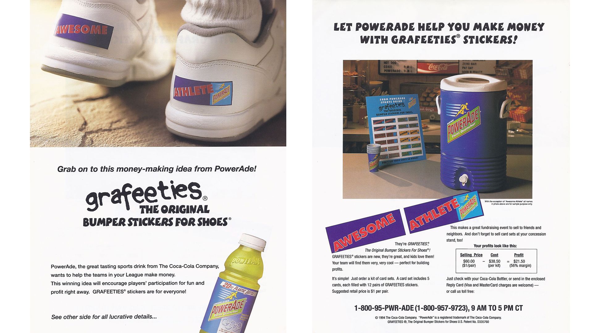
Grafeeties
Client: Coca~Cola \ Willson Creative : Location: Chicago
1990s
Stupid 101
So stupid. Yes, I know. How about that early PowerAde logo, though? (Powerade™ now).
but
I got to cut the sticker comps* that went on the back of the shoes and the board. Then they were in a photo shoot. Then they were on my screen. That was cool.
Say Hello
to early times with my new friend Mr. X-Acto!
*A composite layout — usually referred to as a comp in graphic design — is a example presentation of a design proposal that a graphic artist or advertising agency presents to a client. The comp shows the relative size, position, design and application of images and text even though these elements/components are not yet available.


